Documentation
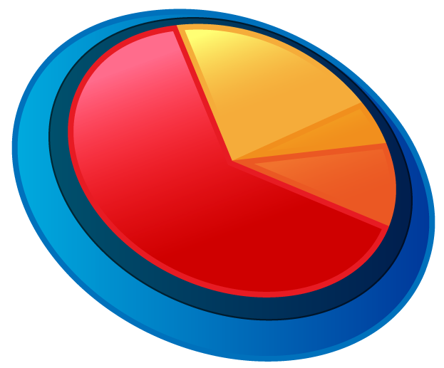
Delicious Data pie charts can be applied to any block-level HTML element. By default, the chart is sized to fit the element based on its height. So for the chart to be visible, the element must be styled with a fixed height. Also, if you plan to use the hover labels rather than the static labels (see below) the element should be styled with relative, absolute or fixed position.
To apply the plugin to the element, use a standard jQuery selector method followed by a call to the ddPieChart method:
$('#blockElement').ddPieChart();
The following is a table of the properties to customize your pie chart:
| Property | Required | Values | Details | Example |
|---|---|---|---|---|
| center_x | no | (integer) | By default, the pie chart centers itself in the element, should you wish to change its position, you can override this property with an integer that represents the distance in pixels from the left side. | center_x: 250 |
| center_y | no | (integer) | Same idea as center_x, just on the y axis from the top edge. | center_y: 100 |
| label | no | name_only percent value none |
If you'd like each wedge to be labeled, set this property to 'percent' or 'value' as a string, to display either the percentage of the whole pie, or the actual entered value of the wedge, respectively. To display only the name of the wedge (as defined in the name property of each wedge) set to 'name_only'. With any of these options, to display the name, the name property must be set on each wedge. | label: 'percent' |
| label_color | no | (color string) | This parameter sets the color of the text in the static labels only. It defaults to black if not set. | label_color: '#444444' |
| label_hover | no | (boolean) | Should you wish for the labels to appear only onmouseover (and onclick for mobile compatibility) set this to true. It is false by default. These labels are also fully stylable through us of id "dd_label_box". | label_hover: true |
| radius | no | (integer) | By default, the radius is half the height of its container so the chart fills the element. Should you wish to override that (like when labels extend beyond the borders of the screen, for example), set this property to an integer. | radius: 100 |
| thickness | no | (integer) | This property is only used when type is set to 'ring' and determines the pixel thickness of the ring chart inward from the radius. It defaults to 10 if not explicitly set. | thickness: 25 |
| type | no | pie ring |
The value defaults to 'pie', but when changed to 'ring' it draws rings rather than full wedges. | type: 'ring' |
| wedges | yes | (array of objects) | Without these objects, there are no pie wedges on the chart. A more detailed breakdown of their use and syntax follows this table. | [{value: 55, color: '#cc3300'}, {value: 102, color: '#33cc00'}] |
The following is a table of properties that define the objects that are declared as an array on the wedge property. One important distinction to note when using these properties: Unlike the start/end & start_time/end_time properties, when using value, the wedges will be drawn as a percentage of the whole sum, which will always result in a complete circle. Whereas with the other properties you can specify precisely where the wedges are drawn, even with visual gaps between them if you so choose.
| Property | Required | Values | Details | Example |
|---|---|---|---|---|
| color | yes | (color string) | This property simply defines the fill color of the wedge itself. It accepts any valid CSS-compatible color formats like hex, rgb, hsl, etc. | color: '#cc3300' |
| end | yes 1 | (decimal) | This (in conjunction with the start property) defines the end point of the wedge in degrees around the circle. 0 is at the topmost point of the circle and progresses 360° clockwise. | end: 120 |
| end_time | yes 2 | (time string) | This (in conjunction with the start_time property) defines the end point of the wedge as a representation of time on a face clock. | end_time: '9:30' |
| name | no | (string) | This allows you to give a specific name to each wedge that will display only when one of the labeling options has been previously enabled for the chart. | end_time: '9:30' |
| start | yes 1 | (decmial) | This (in conjunction with the end property) defines the beginning of the wedge in degrees around the circle. 0 is at the topmost point of the circle and progresses 360° clockwise. | start: 30.5 |
| start_time | yes 2 | (time string) | This (in conjunction with the end_time property) defines the beginning of the wedge as a representation of time on a face clock. | start_time: '5:00' |
| value | yes 3 | (decimal) | The value property can by any number. The sums of the values of each wedge needn't equal 100, the percentages are calculated in the process of the building of the wedge itself, so these can be the raw values from your dataset. | value: 48.7 |
1, 2, 3 At least one of these properties (or combination of properties) is required to draw the wedges, but using them all simultaneously is unnecessary. The start/end properties will always override the others.
Additionally, there are a few CSS hooks you can target to customize the look and interaction even more. ".dd_wedge" is assigned to each wedge in the pie chart. The following code would allow you to create hover effects on each:
.dd_wedge:hover{
					fill: #000;
					cursor: pointer;
				}
The hover label, when enabled, can also be targeted using the selector ".dd_label_box". When the label is made visible, its opacity is set to 1, and it is also assigned the class ".dd_label_visible". Simply by adding a CSS transition on ".dd_label_box", you can get a fade-in, fade-out effect. Should you wish to do more elaborate animations, you can assign those to the ".dd_label_visible" class. For text-alignment, and other purposes, the label is assigned either the "left_hemis" class or the "right_hemis" class depending on whether it's to the left or right of the chart, respectively.
Example 1:
$('#blockElement').ddPieChart({
					wedges:[
					{value: 40, color: '#ed1c24'},
					{value: 35, color: '#f15a24'},
					{value: 25, color: '#f7931e'}]
					});
#blockElement{
					width: 500px;
					height: 250px;
				}
Example 2:
$('#blockElement').ddPieChart([
					label: 'percent',
					label_color: '#0033cc',
					radius: 115,
					thickness: 20,
					type: 'ring',
					wedges:[
						{value: 40, color: '#ed1c24', name: 'Oreo'},
						{value: 35, color: '#f15a24', name: 'Chips Ahoy'},
						{value: 25, color: '#f7931e', name: 'E.L. Fudge'}]
					});
#blockElement{
					width: 500px;
					height: 250px;
				}
Example 3:
$('#blockElement').ddPieChart({
					center_x: 175,
					center_y: 75,
					label: 'name_only',
					label_hover: true,
					radius: 75,
					wedges:[
						{start_time: '1:30', end_time: '4:00', color: '#ed1c24', name: 'Oreo'},
						{start_time: '6:00', end_time: '8:15', color: '#f15a24', name: 'Chips Ahoy'},
						{start_time: '9:00', end_time: '10:00', color: '#f7931e', name: 'E.L. Fudge'}]
					});
#blockElement{
					position: relative;
					width: 500px;
					height: 250px;
				}

				.dd_wedge:hover{
					fill: #999;
				}

				.dd_label_box{
					padding: 0 .5em;
					border-radius: 25px;
					box-shadow: 0 0 4px rgba(0,0,0,0.5);
					border: solid 2px #fff;
					background-color: #999;
					color: #fff;
					transition: opacity .3s linear;
				}